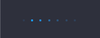
运行状态效果
效果
代码
html
<!DOCTYPE html>
<html lang="en">
  <head>
    <meta charset="UTF-8" />
    <meta name="viewport" content="width=device-width, initial-scale=1.0" />
    <title>运行动画效果</title>
    <style>
      body{
        background-color: #2E303C;
      }
      .circles span {
        display: block;
        float: left;
        width: 3px;
        height: 3px;
        background-color: #10A1FF;
        margin: 0 4.7px;
        border-radius: 50%;
        opacity: 0.2;
      }
      .circles.active span {
        animation: lightBulb___3sPp7 5s infinite;

      }
      @keyframes lightBulb___3sPp7 {
          0%{
            opacity: 1;
          }
          100%{
            opacity: 0.1;
          }
        }
      .circles.active span {
        animation: lightBulb___3sPp7 5s infinite;
      }
      .circles.active .circle1{
        animation-delay: 4.9s;
      }
      .circles.active .circle2{
        animation-delay: 4.2s;
      }
      .circles.active .circle3{
        animation-delay: 3.5s;
      }
      .circles.active .circle4{
        animation-delay: 2.8s;
      }
      .circles.active .circle5{
        animation-delay: 2.1s;
      }
      .circles.active .circle6{
        animation-delay: 1.4s;
      }
      .circles.active .circle7{
        animation-delay: 0.7s;
      }
    </style>
  </head>
  <body>
    <div class="circles active">
      <span class="circle1"></span>
      <span class="circle2"></span>
      <span class="circle3"></span>
      <span class="circle4"></span>
      <span class="circle5"></span>
      <span class="circle6"></span>
      <span class="circle7"></span>
    </div>
  </body>
</html>