html+css实现switch开关效果
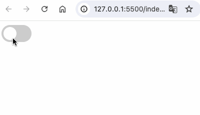
效果:
代码:
html
<!DOCTYPE html>
<html lang="en">
<head>
<meta charset="UTF-8">
<meta name="viewport" content="width=device-width, initial-scale=1.0">
<title>Switch Light Effect</title>
<!-- switch开关效果 -->
<style>
  .switch {
    position: relative;
    display: inline-block;
    width: 60px;
    height: 34px;
  }
  .switch input {
    opacity: 0;
    width: 0;
    height: 0;
  }
  .slider {
    position: absolute;
    cursor: pointer;
    top: 0;
    left: 0;
    right: 0;
    bottom: 0;
    background-color: #ccc;
    -webkit-transition: .4s;
    transition: .4s;
  }
  .slider:before {
    position: absolute;
    content: "";
    height: 26px;
    width: 26px;
    left: 4px;
    bottom: 4px;
    background-color: white;
    -webkit-transition: .4s;
    transition: .4s;
  }
  input:checked + .slider {
    background-color: #2196F3;
  }
  input:checked + .slider:before {
    -webkit-transform: translateX(26px);
    -ms-transform: translateX(26px);
    transform: translateX(26px);
  }
  .slider.round {
    border-radius: 34px;
  }
  .slider.round:before {
    border-radius: 50%;
  }
</style>
</head>
<body>

<label class="switch">
  <input type="checkbox" id="toggle" />
  <span class="slider round"></span>
</label>

</body>
</html>